PROJECT OVERVIEW:
I had the chance to revamp the Jobcase network (JCN) registration flow for everyjobforme.com. This flow serves as the landing page for visitors from SEM, Facebook, and Google job ads. Although the existing flow was successful in attracting new members and boosting revenue, I saw room for improvement. My goal was to enhance the design and prioritize enhancing the user's experience to an even greater extent.
MY ROLE:
Lead Product Designer
Conducted usability research (live interviews)
Visual and interaction design
TEAM:
Overseen by senior product designer, and product design manager
CONSTRAINTS:
The team met every other week, and the project's progress could be paused depending on individual bandwidth.
RESULT
CURRENT EXPERIENCE
Only focused on the first half of this flow, which was focused on capturing new members and the email triggers that followed.
PROBLEM STATEMENT
The original purpose of this flow was revenue driven, to increase membership in both JCN and Jobcase.com, and provide relevant jobs based on the original ad. After evaluating the current flow, it is clear that the UI needs updating and the process has too many steps. Also the is a big disconnect between the two companies, having no mention of Jobcase until the first triggered email. Which can lead to confusion as to what the user actually signed up for. How might we show accurate job results and bridge the gap between Jobcase.com and JCN going through seamless onboarding experience?
USER INTERVIEWS
To validate my assumptions and discover additional areas for improvement, I conducted user interviews first on the current flow and design. I decided to do live interviews to get real time reactions as users were going through the flow.
IDENTIFYING THEMES & PAIN POINTS
Looks like it’s trying to collect info from me without telling me more about the job...
Barb - 33 - Female
I don't necessarily know them and theres so many scams today I wouldn't just click.
Dekel - 36 - Male
Were you really trying to help me...or were you just trying to collect all this information about me?
Leonela - 36 - Female
I expect this ad to take me to JetBlue job listings page.
Alex - 30 - Male
Is it through jobcase or everyjobforme?
Niah - 26 - Female
REVISED USER FLOW
In this step, my primary focus was to incorporate user feedback and identify their pain points in order to design a seamless flow that eliminates any confusion or uncertainty as users move through the flow.
DIGITAL LOW FI WIREFRAMES
MED FI DESIGNS
I had several ideas on how to enhance the redesign and improve user interaction. After reviewing comp intel and doing more research, I decided to go with Iteration 3 as my MVP because it offered the strongest approach.
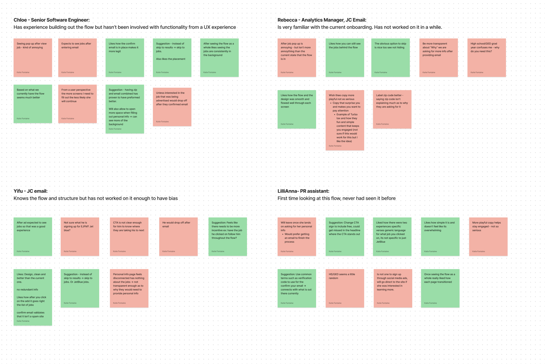
USER INTERVIEWS TAKE 2
For the second round of testing, I approached a few colleagues, both familiar and unfamiliar with the flow. Time constraints played a role, but the main goal was to gather different perspectives and leverage their understanding of the project.
User Feedback Themes
Make sure the copy is attention grabbing
Even more transparency when asking for their information
Like how the jobs are after the ad verses going straight to the flow
Losing attention quickly because what they expect gets derailed when the flow pops up
FINAL LEARNINGS
I learned the importance of open-minded research, understanding user needs, and building trust. Integrating the Jobcase.com logo in the flow addressed brand disconnect, and displaying job listings before onboarding enhanced trust. Given more time, I wanted to test SSO with Google, use text messages for verification, improve pop-up card copy, and explore interactive designs for better user experience.


